Every community has a housing story. The challenge has always been that the data to tell it is scattered across half a dozen sources, each with its own geography, release schedule, and format. We built Housing Forecast to bring those pieces together.
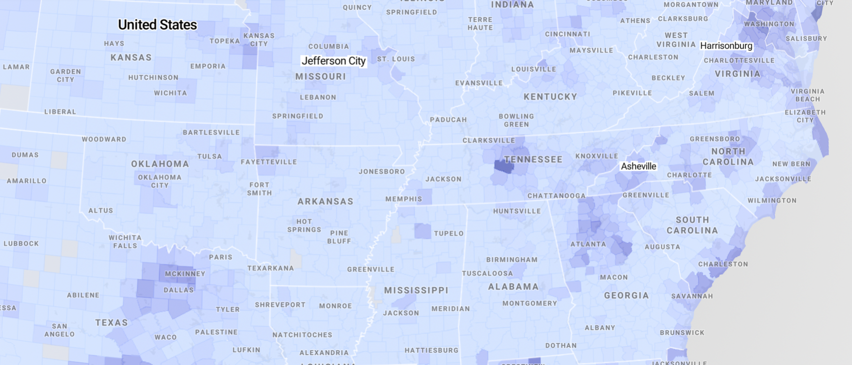
Housing Forecast is a free dashboard covering every city, town, and county in the US. It draws on the American Community Survey, Census PUMS, Bureau of Labor Statistics, HUD, LODES, and private data sources to show how housing conditions are changing in a community, and what those changes mean for the people who live there.
What you’ll find
Start by searching for any place in the country. For McKinney, TX, for instance, you’ll see population projections showing how rapidly the city has grown and where that growth is headed. Scroll down and you’ll find household composition trends, a breakdown of the housing stock by type and tenure, and affordability metrics comparing the area median income to the income required to afford a typical home.
Each community’s dashboard concludes with a housing production target: an estimate of how many additional units would need to be built to accommodate projected growth and reduce the supply pressures that make housing less affordable. This is the number that turns a diagnostic into a conversation about action.
Charts include their data sources and methodology, and they update as new data is released. If you want to go deeper, the documentation is on GitHub.
Why we built it
At CommunityScale, we spend most of our time working directly with communities on housing needs assessments, zoning analyses, and planning studies. That work consistently reveals the same pattern: housing conversations stall when different stakeholders are working with different information. A planning board member cites one set of numbers, a developer another, and a neighborhood group a third. Before anyone can discuss solutions, they first have to agree on the problem.
Housing Forecast gives everyone the same starting point. It uses consistent definitions, data sources, and methodology across every geography, so comparisons between communities are apples-to-apples, and conversations can move from “is there a problem?” to “what should we do about it?”
We believe the most productive housing conversations focus on supply. When we look at communities that have made real progress on affordability, the common thread is that they’ve found ways to get more housing built, in more places, at more price points. Housing Forecast is designed around that framing: it highlights the gap between what a community has and what it needs, and points toward the production response that could close it.
How we think about the data
The American Community Survey is the gold standard for demographic and housing data, but its 5-year estimates inherently look backward. The 2024 release, for example, reflects conditions averaged across 2020 to 2024. That’s a rich foundation, but it can miss sharp turns.
We supplement ACS and PUMS with higher-frequency data: Zillow’s Home Value Index for monthly home value and rental trends, BLS data for inflation adjustment, and HUD income limits for the AMI calculations that anchor our affordability analysis. By blending the ACS’s comprehensive demographic detail with these more current market signals, Housing Forecast can produce analyses that are both demographically grounded and responsive to what’s happening now.
Population projections use a cohort-based approach, analyzing how age groups within a community have shifted over the past decade and projecting those trends forward. This captures the dynamics that matter most for housing: a community with a growing population of 30-somethings faces very different housing needs than one with a rapidly growing retiree population.
Who it’s for
We designed Housing Forecast for anyone with a stake in local housing conditions.
If you’re a planner or municipal staffer, you now have a shared baseline you can point to in conversations with elected officials, developers, and residents. If you’re a policymaker or advocate, you can pull charts directly into a presentation, a grant proposal, or public testimony to illustrate why a particular reform or investment matters. If you’re a developer or financial professional, you can quickly assess supply gaps and demand signals in communities you’re evaluating. And if you’re a curious resident, you can explore why housing feels harder to find in your community and what the data says about why.
What’s next
Housing Forecast is in beta. We’re continuing to add data sources, refine the methodology, and expand the set of metrics available for each community. We have custom dashboards in development for the Catawba Regional Council of Governments in South Carolina and the North Central Texas Council of Governments, and we’re actively working with other regional agencies and municipalities on tailored versions.
If your organization could benefit from a custom Housing Forecast, or if you need additional planning services around housing supply and zoning, get in touch. And if you want to stay informed as we add new features, sign up for updates.
We think every community deserves to understand its housing story. Housing Forecast is our way of making that possible.